| Excel Dashboard Steps |
|
|
|
|
|
|

|
|
|
|
|
| 1 |
Format Data in Table |
|
|
Name
the table - Data |
|
|

|
|
| 2 |
Create first Pivot for Line Chart |
|
|
|
Name:
LinePivot |
|
|
Group Dates by Month & Year |
|
|
Format Numbers |
|
|
Insert Line Chart |
|
|
|
|

|
|
| 3 |
Create Bar by Category |
|
|
Copy Line Chart sheet |
|
|
Name:
CategoryPivot |
|
|
Sort Grand Total in ascending order |
|
|
|
|
|
| 4 |

|
|
|
Name:
ManagerPivot |
|
|
Sort Grand Total for state in ascending order |
|
|
|
|
|
|
|
|
|
|
|
| 5 |
Create Pie Pivot |
|
|
Name:
PiePivot |
|
|
Set to 'show items with no data' |
|
|
|
|
|
|
|
|
|
|

|
|
| 6 |
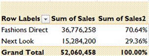
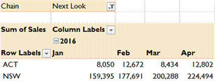
Create Sparkline Pivots |
|
|
Name:
SparklineTotalPivot |
|
|
Name:
SparklineNextPivot |
|
|
Name:
SparklineFashionsPivot |
|
|
Set to 'show items with no data' |
|
|
|
|
|
|
| 7 |
Create Map Pivot |
|
|
|
Name:
MapPivot |
|
|
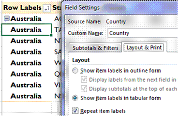
Country Field Settings Tabular & Repeat Labels |
|
|
Remove Grand Totals |
|
|
Copy PivotTable and paste beside as values |
|
|
Insert Map Chart |
|
|
Edit the chart range so it points to the PivotTable again |
|
|
|
|
|
|
|
|
|
|
|
| 8 |
Create Dashboard sheet and move charts |
|
|
|
- Set up Sparklines (use IF to handle states) |
|
|
=IF('Sparkline Pivots'!A6="","",'Sparkline
Pivots'!A6) |
|
|
|
|
|
- Add Conditional Formatting bars (show bar only) |
|
|
- Use GETPIVOTDATA to Map Pivot & IFERROR |
|
|
=IFERROR(GETPIVOTDATA("Sales",'Map
Pivot'!$A$3,"State",D28,"Country","Australia"),"") |
|
|
|
|
|

|
|
| 9 |
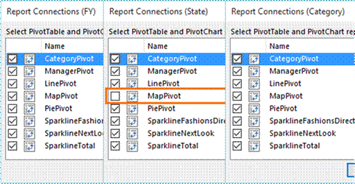
Add Slicers |
|
|
Financial Year |
|
|
State |
|
|
Category |
|
|
| 10 |
Format and align |
|
|
Set Slicer Position and Layout to 'Disable Resizing' |
|
|
Set Theme - Parcel |
|
|
| 11 |
Add July Data |
|
|
Refresh All |
|
|

|
|
| 12 |
Dynamic labels |
|
|
Legend |
|
|
Pie Chart labels (wrap cells) |
|
|
| 13 |
Workbook & Worksheet Protection |
|
|
Instructions here |
|
|
|
|
|
|
|
|
|
|
|
|
|
|
|
|


